
Confusing menus, long sales forms, and wasted space (oh my!). Those are just a few head-scratching trends I’ve seen from looking at 70+ Software-as-a-Service (SaaS) websites.
The SaaS landscape is a highly-competitive battlefield for user attention and ever-shrinking budget dollars. But even if you’re a small business, you can learn from these errors.
It’s where simple mistakes become catastrophic as you try to turn website visitors into booked demos or paying customers.
For now, here are five items that make me, as a marketer and as a tech buyer, scratch my head:
Logos vs. Testimonials | A two-column layout issue | Long sales forms | Bloated menus | Gated demos
The data set currently (as of 4/26) has 75 SaaS websites with various revenue ranges and several offerings. You can look at the Google Sheet with my notes to dig in yourself – each visit was manual, using Chrome in Incognito.
I plan to keep adding to this and updating the findings on this page once I hit higher thresholds.
Have suggestions to improve? Want to see something else? Hit me up on LinkedIn.
Logos > Testimonials? Why?
On nearly every SaaS website you visit, you’ll see the typical logo strip – that line of “companies who trust us include” with a handful of logos you may or may not have heard of before.
74% of sites had the logo strip on their homepage.
I get why – it’s often expected from buyers. You can consider this a “check the box” type of social proof on the page where a prospect may learn about you for the first time.
But 39/41 (95%) with both a logo strip and customer testimonial on the homepage showed the logos first.
Why?!
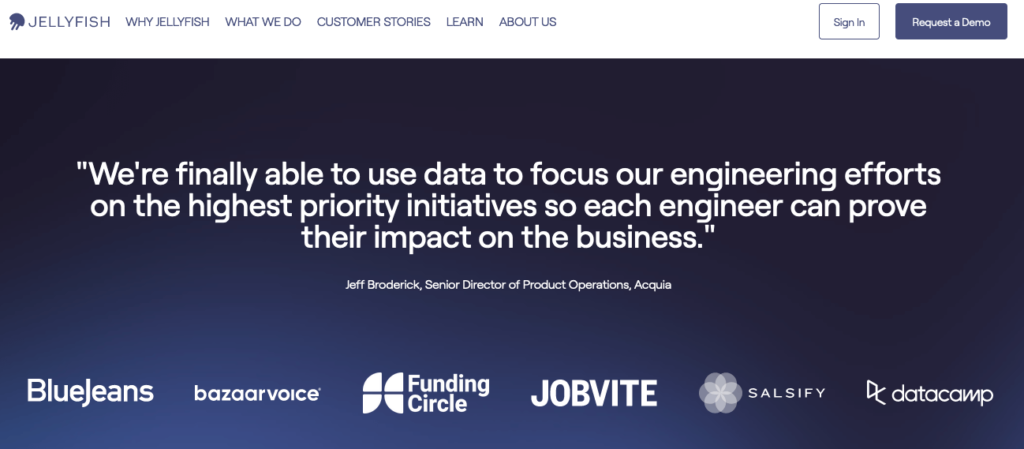
The image here is one of the two that didn’t, from Jellyfish. See how your attention goes to the quote, and that’s the emphasis? It’s also pretty high on the homepage, so it hits users learning about the platform early in their on-site discovery.
In many cases, the first (or only) testimonial was multiple scrolls down the page. In other words, most page visitors would never see those testimonials.
If everyone has a logo strip, you’re doing yourself few favors by blending in.
How to improve:
A good testimonial from someone in your ideal customer profile puts a name to an actual user experience of what you’re offering. It’s more impactful because it can speak to specific pains or solutions that resonate with your audience and communicate from someone who doesn’t work for you.
Even better? Pull from third-party sites like G2, TrustRadius, or Capterra. Millions of users visit those sites as part of their investigations and trust what they find.
More on this in a moment, in conjunction with focusing on…
Wasted space above-the-fold on homepages
62% of the homepages used a two-column layout on desktop. However, on mobile, what’s in the left column appears first, with the right column usually appearing underneath.
It’s what’s in that right column that confuses me. Of those with two-column layouts above the fold, only one put social proof in that high-priority slot.
Most had some animated image, screenshots of the platform, or a video introducing the product.
How to improve:
Ask yourself: Why would a person visit our homepage?
I bucket the reasons into two primary categories:
- They’re learning about your company for the first time
- They’re a repeat visitor trying to get to something specific
Let’s focus on those net-new prospects who are just learning about you.
They’re on your homepage. And still need convincing you’re the solution of their dreams. It’s on you to highlight how you can solve their pains and provide enough evidence that you’re credible.
If SaaS buyers trust online recommendations and it’s been shown to have more impact than “any marketing strategy,” then putting filler content into that right-hand column that first loads on your homepage is a missed opportunity.
A testimonial, a G2 badge, Forrester/Gartner report, or a quote from a news outlet … your best social proof belongs front and center. Cut the fluff and put your best (content) foot forward!
Bloated sales forms
67% of “contact sales” forms had six or more fields (including 24% with nine or greater) – and that’s not accounting for privacy checkboxes or CAPTCHA challenges.
Per research from WPForms (and others), the fewer fields in a form, the higher the rate people actually complete the form.
Three is a magic number, but up to five tends to have solid results of at least 20% of visitors filling out the form
The real dip starts at six.
Yes, the number when conversion rates drop is the same threshold that 2/3 of the sites went over.
Yikes!
How to improve:
This involves an understanding of what happens to the information you’re collecting. If you’re in marketing, you should know the ins and outs of the sales process already.
Which fields do you have to get from a prospect? The person’s name and email address are the bare minimum.
What information could your company provide on its own? A lot more than you might think.
Suppose you have tools like ZoomInfo, 6Sense, or other data enrichment providers – great! You have automation that can fill in gaps without putting up unnecessary barriers.
If you don’t? It might require a bit of manual labor, but it’s still feasible.
For instance: Instead of asking for your prospect’s CRM in the form, use a tool like BuiltWith to check the target’s company and get a sense of what they might have in their stack.
Don’t ask how many employees are on a given team. Instead, have the salesperson spend 2-5 minutes on LinkedIn looking through the company’s LinkedIn page employees.
Does it require a bit of elbow grease? Unfortunately, yes. But for many SaaS companies with tight marketing budgets, a pricey piece of software may be unfeasible – but you still need to serve your prospect and reduce barriers to them becoming a valid lead.
Oh, and have you checked your automated emails sent before the actual meeting? Why not use those as a value-add to set expectations for an agenda + ask questions you’ll need answers to? You might be surprised at how effective it is at getting additional information!
Needlessly complex menus
I saw an average of eight items in the menu. By itself, that number may not mean a lot, but here are a few caveats:
- 22% had 10+ showing
- 76% also had dropdowns
Do your website visitors need links to your blog, case studies, leadership page, latest eBook, or a direct phone line to your sales team?
Probably not.
Especially if you have intricate dropdowns that make it all the more difficult to find the most relevant information to what they’re looking for.
How to improve:
If you have heat mapping software, note what menu options are engaged with. Right away, you can find an item or two to remove altogether. (If you don’t, Microsoft Clarity is free)
You can also look into your analytics and discover where users go after landing on a page. For example, where might somebody typically go – or want to visit after your homepage? Answering that can determine exactly what’s in your main navigation.
Putting yourself in your ideal customer’s shoes and understanding their preferences can drive more efficient experiences!
Gated demos
Why is this so common?!
Of those who had a product tour or demo offering, all but one (93%) blocked it with a form.
“Hi, thanks for checking us out. We know you’re investigating us further and are interested in going through our platform.
Instead of just giving you what you want, can you fill out this form first so our sales team can pester you? Thanks!”
^Literally what runs through my mind anytime a product tour or video demo is gated.
This is possibly the least customer-centric item I found. If your target buyer is investigating, you’re clearly on their consideration list – why would you throw up a barrier to them gathering more information to get a more informed opinion?
They don’t want to talk to sales.
I’m a fan of interactive demos or even just a solid walkthrough, and there’s plenty of pressure to make a great impression. But if you’re going to offer it to me, let me do it on my terms – otherwise, I’m more likely to find a tool that will.
Get in-depth insights into your digital CX with our SaaS marketing consulting services.
Comments are closed